UXAD
Alecto DVM-70
This project proposes an optimization of the interaction and user experience of the Alecto DVM-70 baby monitor. The product and its market has been analysed thoroughly. Information was gathered through literature research, interviews, a contextual user study, a usability study and a final user test.
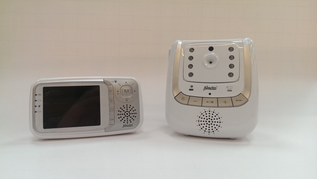
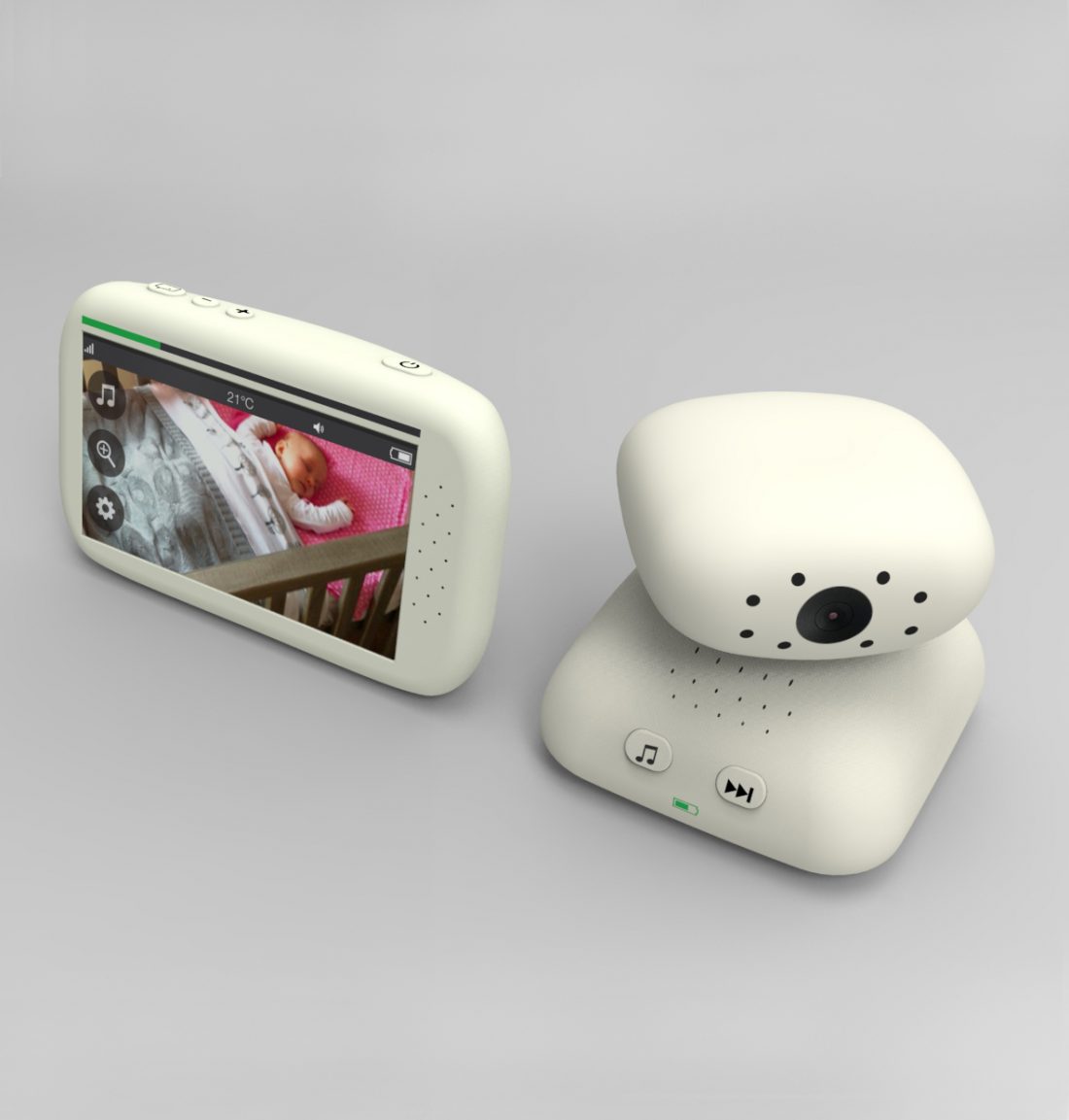
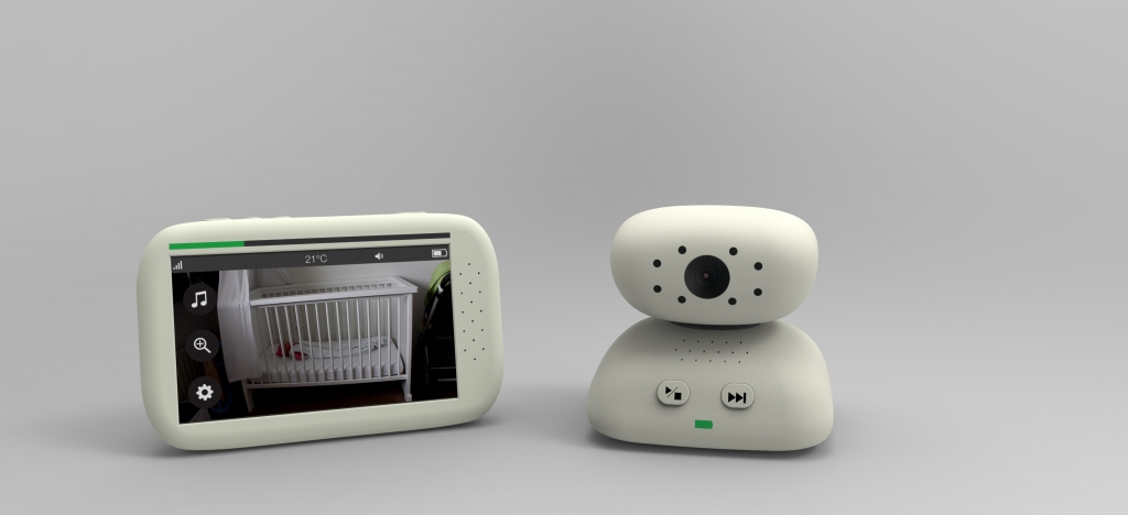
The Alecto DVM-70 baby monitor is an extensive model with many functions: it has a camera with night vision, it can play lullabies, it has an talk back function and a temperature sensor among others. The baby monitor consists of two parts: a baby unit and a parent unit. The baby unit is placed in the baby room and monitors the child with a camera and microphone. The parent unit is carried by the parents and enables them to see and hear everything what is going on in the baby room.
From the user test it was clear that many people experienced problems with the usability of the product and therefore were hesitant and insecure in their actions. Users should feel confident that the baby monitor will inform them if something happens to their child. In other words, the product should establish a feeling of trust towards the user. It should be a reliable friend on whom the user can count. Both the aesthetics and usability should contribute to this feeling of trust.
Approach
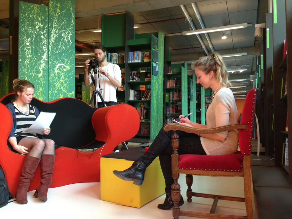
As one of the six interaction designers I pushed for a qualitative contextual user study first and a second separate usability study.
My primary focus for the first user study was to set up a qualitative research approach by understanding the user group better by doing a literature research. We asked the participants to think aloud and therefore could link gestures/actions to their thoughts. This study helped to understand the feeling, context and needs around a baby monitor better.
During the second usability study my focus was on finding overlapping usability experiences that could be improved. Based on these findings I designed the responsive interface.
Finally we all contributed to the writing of a scientific paper that concluded our project.
User Research
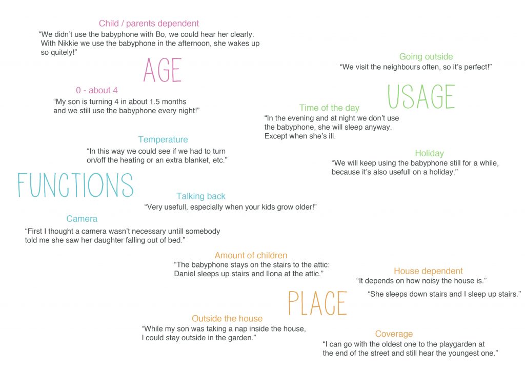
The contextual study and usability study showed that there were some problems concerning the user experience and usability. Participants had problems with understanding the meaning of the icons and indicators on the parent unit. Navigation through the menu was not clear on many levels. Receiving feedback from the device was unclear, but also unpleasant. Some participants indicated that they value consistency in appearance which was missing for the current baby monitor.
These insights were translated into design motivations. Inconsistency and errors in the interface contribute to feelings of distrust from the users towards the product. Therefore improving the placing of buttons and reorganizing the interface will optimize the user experience. Also, the parent and baby unit should belong together aesthetically.
Further details of the research can be found in scientific paper:
Results
Trust, connectedness and Calmness
Users of the baby monitor should feel confident that it will inform them if something happens to their child. In other words, the product should establish a feeling of trust towards the user. Both the aesthetics and usability should contribute to this feeling of trust.
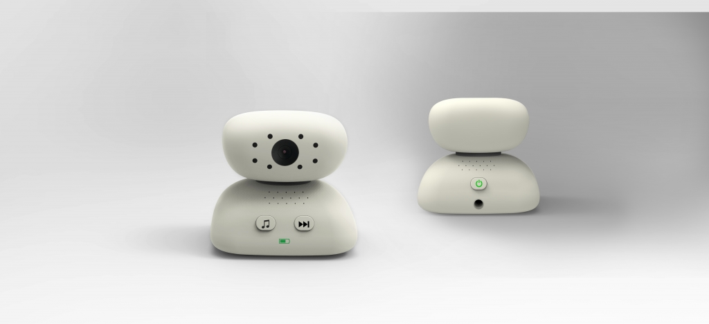
The form of a pebble stone was chosen as form language for both the parent and baby unit because of its symbolism. Stacked stones are often used in Zen Gardens and articulate a spiritual meaning. The stacking of stones acts on the practice of patience and the physical effort of creating balance.
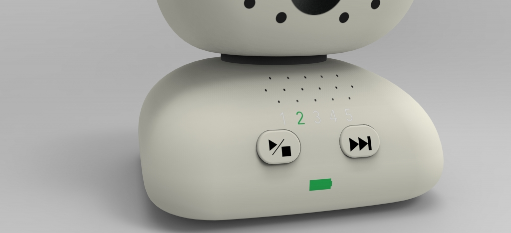
Other decisions included the implementation of a decibel meter. This gives the user valuable information without having to listen to the baby monitor. Furthermore battery and song feedback are user-friendly ways to create connectedness with the baby and increases trust in the device.
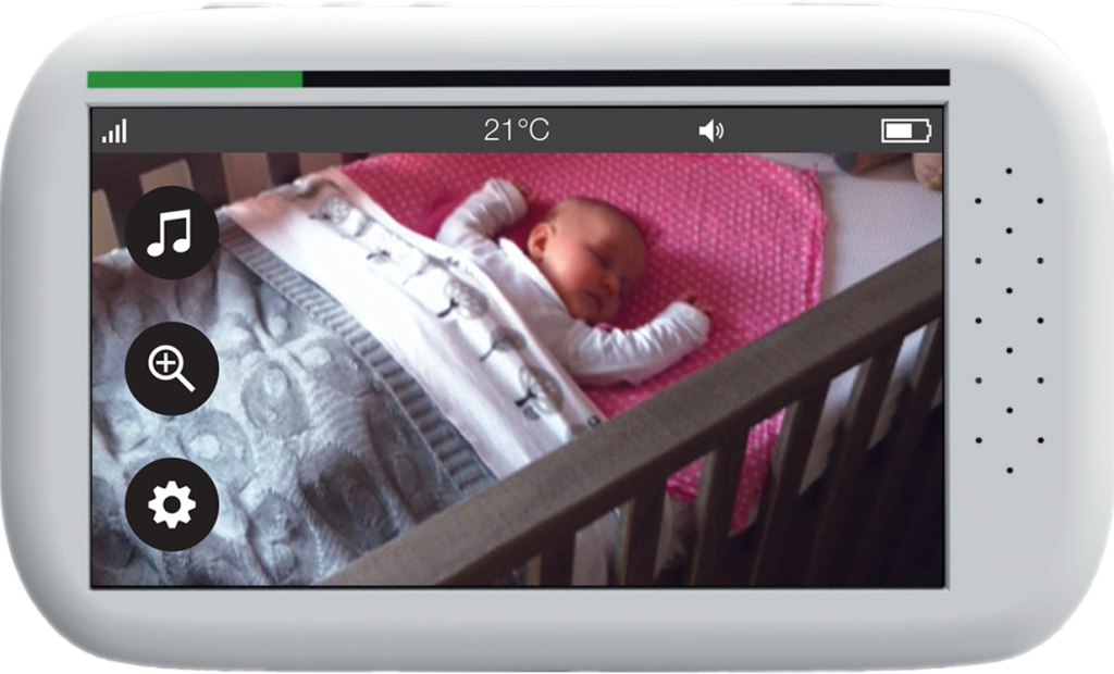
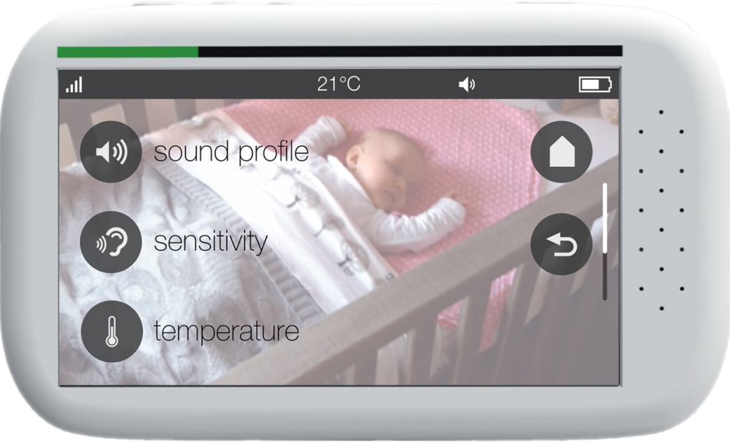
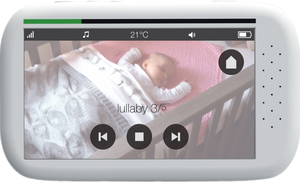
The redesigned parent unit has a touch screen because it has advantages over a normal screen on both operational and aesthetic level. Commonly used icons and indicators were used to replace currently unclear ones.
Please feel free to try the interface below yourself: